Two simple changes to improve your stakeholder mapping
- Kerin Leonard
- Nov 1, 2021
- 3 min read
Updated: Aug 8, 2023
The tools we use can make or break a project's approach to stakeholders from the start.
The traditional stakeholder matrix
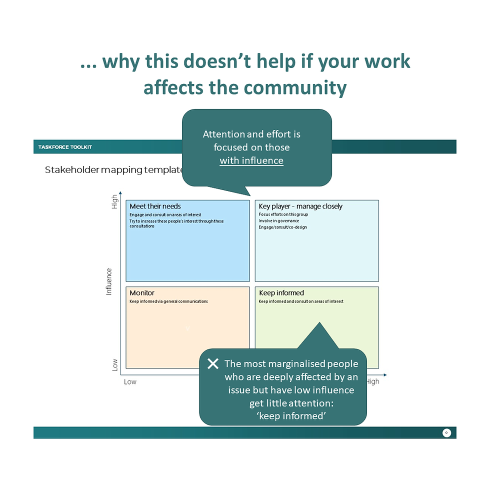
The image below is a familiar one to many project planners. It's been used in some form for decades. It asks the user to identify and map stakeholders based on their interest in, and influence over, a project’s objectives. Many public servants and consultants have used it. I have.

But when applied to issues and decisions that affect the community, this matrix has significant limitations.

Stakeholders with a high degree of interest and a high degree of influence end up being mapped as the most important. You’ll see from the example above that the instructions for the group in the top-right quadrant is to: ‘Focus efforts on this group. Involve in governance. Engage/consult/co-design’. But who is likely to end up in this category? Decision-makers, significant lobbying interests (businesses, services, professional and industry groups, peak bodies), high-profile people. This approach entrenches existing power structures.
Those with high interest but low influence end up being mapped to the bottom-right quadrant. The accompanying instruction for this group is to ‘Keep informed and consult on areas of interest’.
The problem for those of us who work in social policy is that the majority of individuals affected by our decisions, and especially the most marginalised people in our community, are likely to be mapped to this bottom-right quadrant. Following the traditional matrix would suggest that they receive a fairly passive engagement response—they will be 'informed'.
Such an outcome doesn’t help governments to understand people’s needs, the barriers people are experiencing, or the range of solutions that might work. It can lead to poor policy advice. It also side-lines the opportunity to build understanding and trust between governments or service providers and the people that they serve: a commodity that we have seen in recent years is both fragile and essential for the health of our democracies.
Does the stakeholder matrix still serve us?
I've wondered whether it's time that we took a leaf out of Marie Kondo’s book: thank the traditional stakeholder engagement matrix for its service, and let it go.
But as I've reflected, I think there is still value in a simple matrix that helps to bring stakeholders into view.
As someone who's managed a number of big policy projects and community engagement for a Royal Commission, I appreciate the value of tools that help us to think through and present complex information in a digestible form.
And some of the questions in the matrix are still relevant:
When working on complex social policy questions, considering who has influence is important. People with influence can have important information and perspectives. The use of their influence can support or derail your endeavours. It's only by asking this question about influence that we build an understanding of the current power structures.
How interested people are is information that can be helpful, but I don’t think it’s the most critical information when using this tool in a social policy context. I would only spend time mapping stakeholders with ‘an interest’ in some form on the matrix.
So, rather than throwing the matrix out I want to upcycle it.
A new approach
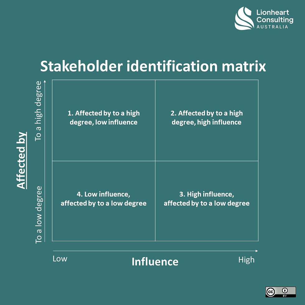
Two simple changes to the traditional matrix can make a radical difference to our processes and our outcomes:
Change 'interest' to 'affected by'
Make this your vertical axis

oes not determine your approach to working with stakeholders
With these changes, attention and effort is better focused on the area (the top left quadrant) where tailored strategies may be required to remove barriers to stakeholder participation.
As a final tip when using this matrix, it's important for us to be clear about what it does and doesn't help with. It's good at identification: helping us to think about and describe who our stakeholders are and why. But it's not the full story (far from it) when figuring out our approach to working with stakeholders.
Working with stakeholders helps us to better understand issues and possible solutions. For those who support governments and service providers, good stakeholder work helps our leaders to be better informed when making hard decisions in a complex world. I'm interested in how we get the best start to that.

Comments